
Light Mode Palette
Light mode emphasizes clarity, brightness, and high contrast. Colors are defined usingoklch() for perceptual consistency.
| Category | Token | Color | Description | |
|---|---|---|---|---|
| Primary | --color-primary | oklch(0.205 0 0) | Used for main actions, buttons, and highlights. | |
| Primary Foreground | --color-primary-fg | oklch(0.985 0 0) | Text or icons displayed on primary backgrounds. | |
| Secondary | --color-secondary | oklch(0.97 0 0) | Used for secondary actions or subtle emphasis. | |
| Secondary Foreground | --color-secondary-fg | oklch(0.205 0 0) | Text on secondary backgrounds. | |
| Accent | --color-accent | oklch(0.97 0 0) | Decorative elements or subtle highlights. | |
| Accent Foreground | --color-accent-fg | oklch(0.205 0 0) | Text or icons on accent backgrounds. | |
| Background | --color-background | oklch(1 0 0) | Page background. | |
| Foreground | --color-foreground | oklch(0.145 0 0) | Default text color. | |
| Card | --color-card | oklch(1 0 0) | Card or panel backgrounds. | |
| Card Foreground | --color-card-fg | oklch(0.145 0 0) | Text inside cards. | |
| Popover | --color-popover | oklch(1 0 0) | Popover or tooltip background. | |
| Popover Foreground | --color-popover-fg | oklch(0.145 0 0) | Text inside popovers. | |
| Muted | --color-muted | oklch(0.97 0 0) | Less prominent text or UI elements. | |
| Muted Foreground | --color-muted-fg | oklch(0.556 0 0) | Text displayed on muted backgrounds. | |
| Destructive | --color-destructive | oklch(0.577 0.245 27.325) | Warnings, errors, or destructive actions. | |
| Destructive Foreground | --color-destructive-fg | oklch(0.985 0 0) | Text on destructive backgrounds. | |
| Border | --color-border | oklch(0.922 0 0) | Borders for inputs, cards, and dividers. | |
| Input | --color-input | oklch(0.922 0 0) | Form input backgrounds. | |
| Ring | --color-ring | oklch(0.708 0 0) | Focus indicators. | |
| Radius | --radius | 0.915rem | Border radius. |
| Token | Color |
|---|---|
--color-chart1 | oklch(0.646 0.222 41.116) |
--color-chart2 | oklch(0.6 0.118 184.704) |
--color-chart3 | oklch(0.398 0.07 227.392) |
--color-chart4 | oklch(0.828 0.189 84.429) |
--color-chart5 | oklch(0.769 0.188 70.08) |
| Token | Color | Description |
|---|---|---|
--color-sidebar | oklch(0.985 0 0) | Sidebar background. |
--color-sidebar-fg | oklch(0.145 0 0) | Sidebar text. |
--color-sidebar-primary | oklch(0.205 0 0) | Active primary item. |
--color-sidebar-primary-fg | oklch(0.985 0 0) | Text for primary items. |
--color-sidebar-accent | oklch(0.97 0 0) | Accent item background. |
--color-sidebar-accent-fg | oklch(0.205 0 0) | Accent text. |
--color-sidebar-border | oklch(0.922 0 0) | Sidebar dividers. |
--color-sidebar-ring | oklch(0.708 0 0) | Focus ring inside sidebar. |
Dark Mode Palette
Dark mode emphasizes depth, contrast, and reduced eye strain. Colors useoklch() for perceptual accuracy and consistency.
| Category | Token | Color | Description | |
|---|---|---|---|---|
| Primary | --color-primary | oklch(0.922 0 0) | Used for main actions, buttons, and highlights. | |
| Primary Foreground | --color-primary-fg | #0e0e0e | Text or icons displayed on primary backgrounds. | |
| Secondary | --color-secondary | oklch(0.269 0 0) | Used for secondary actions or subtle emphasis. | |
| Secondary Foreground | --color-secondary-fg | oklch(0.985 0 0) | Text on secondary backgrounds. | |
| Accent | --color-accent | #262626 | Decorative elements or subtle highlights. | |
| Accent Foreground | --color-accent-fg | oklch(0.985 0 0) | Text or icons on accent backgrounds. | |
| Background | --color-background | oklch(0.145 0 0) | Page background. | |
| Foreground | --color-foreground | oklch(0.985 0 0) | Default text color. | |
| Card | --color-card | oklch(0.205 0 0) | Card or panel backgrounds. | |
| Card Foreground | --color-card-fg | oklch(0.985 0 0) | Text inside cards. | |
| Popover | --color-popover | oklch(0.269 0 0) | Popover or tooltip background. | |
| Popover Foreground | --color-popover-fg | oklch(0.985 0 0) | Text inside popovers. | |
| Muted | --color-muted | oklch(0.269 0 0) | Less prominent text or UI elements. | |
| Muted Foreground | --color-muted-fg | oklch(0.708 0 0) | Text displayed on muted backgrounds. | |
| Destructive | --color-destructive | oklch(0.704 0.191 22.216) | Warnings, errors, or destructive actions. | |
| Destructive Foreground | --color-destructive-fg | oklch(0.985 0 0) | Text on destructive backgrounds. | |
| Border | --color-border | oklch(1 0 0 / 10%) | Borders for inputs, cards, and dividers. | |
| Input | --color-input | oklch(1 0 0 / 15%) | Form input backgrounds. | |
| Ring | --color-ring | oklch(0.556 0 0) | Focus indicators. | |
| Radius | --radius | 0.915rem | Border radius. |
| Token | Color |
|---|---|
--color-chart1 | oklch(0.488 0.243 264.376) |
--color-chart2 | oklch(0.696 0.17 162.48) |
--color-chart3 | oklch(0.769 0.188 70.08) |
--color-chart4 | oklch(0.627 0.265 303.9) |
--color-chart5 | oklch(0.645 0.246 16.439) |
| Token | Color | Description |
|---|---|---|
--color-sidebar | oklch(0.205 0 0) | Sidebar background. |
--color-sidebar-fg | oklch(0.985 0 0) | Sidebar text. |
--color-sidebar-primary | oklch(0.488 0.243 264.376) | Active primary item. |
--color-sidebar-primary-fg | oklch(0.985 0 0) | Text for primary items. |
--color-sidebar-accent | oklch(0.269 0 0) | Accent item background. |
--color-sidebar-accent-fg | oklch(0.985 0 0) | Accent text. |
--color-sidebar-border | oklch(1 0 0 / 10%) | Sidebar dividers. |
--color-sidebar-ring | oklch(0.439 0 0) | Focus ring inside sidebar. |
Usage
Include the palette in your css or you can get it here: Dark mode Light modeExample
example.css
Preview
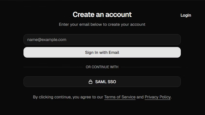
Light mode
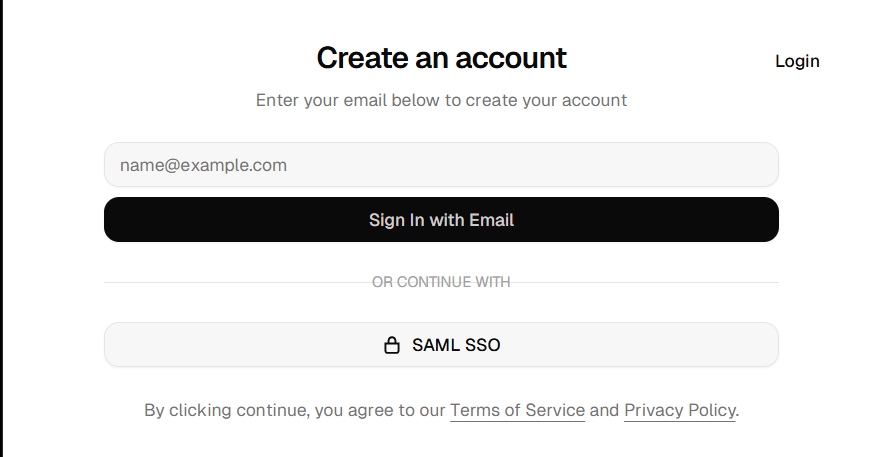
Dark mode